Our group consists of Sam Gillard, Will Hooper, Harry Flook and Bryn Evans. The blog presents our project and all related work.
Friday, 26 March 2010
Tuesday, 23 March 2010
Looking back at your preliminary task, what do you feel you have learnt in the progression from it to the full product?
- Our knowledge of Final Cut Pro and Soundtrack Pro has become greater and we have become more fluent in how we use it.


- We have realized the importance of blogging what we have done. It helped us to have a clearer picture of what we need to do and consolidate all the work we had done so far.
- We incorporated the use of Adobe Illustrator and Adobe Photoshop to create a more professional look to our product.
Labels:
Bryn Evans,
Harry Flook,
Sam Gillard,
Will Hooper
What have you learnt about technologies from the process of constructing this product?
During the process of filming and making our opening sequence, we learned:
- How to make animated titles,
- How to become mo
 re efficient with the software such as Soundtrack Pro, Final Cut Pro and LiveType,
 To use p
 rograms like Adobe Illustrator and PhotoShop, and add files made on there onto Final Cut.
- We had some problems with the technology, for example, the microphone did not always pick up the sound (which we had to dub over later).
- We also had difficulties trying to sync the sound and music with the film on Final Cut - this was the only time we needed any help with the process.
Labels:
Bryn Evans,
Harry Flook,
Sam Gillard,
Will Hooper
How did you attract/address your audience?
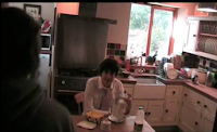
The topic being discussed would attract a certain audience due to relativity of the topic. It covers current issues and addresses the audience in a way that people in a similar situation can relate to, especially the plot and the main character.
Feedback:
- Feedback was mostly positive, feedback that wasn't positive was, however, constructive towards our final cut.
- We decided to keep the pace of our earlier shots as slow as we did because we felt that that time of day (morning) is not fast-paced, so therefore would not be a true representation of time period.

Labels:
Bryn Evans,
Harry Flook,
Sam Gillard,
Will Hooper
Who would be the audience and why?
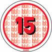
- The film would be a 15 certificate, we agreed on this for two reasons:
- The film contains characters in stressful, high-pressure life events, meaning that the language used could be less restrained. There is no reason why we thought it should be higher than a 15 because it would not fit the criteria of an 18 film.
- The topic of unemployment would not have as much relevance, or importance for possible viewers under the age of 15; because many people under 15 do not have a job and the topic might be seen by many young people as 'unappealing'.
- A more specific demographic that might be people who have been recently affected by the economic downturn. Viewers from this category would be more likely to relate to the plight of the main character.
Labels:
Bryn Evans,
Harry Flook,
Sam Gillard,
Will Hooper
What kind of media institution might distribute your media product and why?
- A rarely portrayed film topic, a current, British film about unemployment might be distributed by a more independent film institution, such as Working Title or Pathe.


Labels:
Bryn Evans,
Harry Flook,
Sam Gillard,
Will Hooper
How does your media product represent particular social groups?

It's more
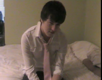 of a fictional portrayal rather than making a social comment about men of a certain age having a mid-life crisis and it just so happens to be that redundancy is the cause of this.
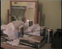
The mise-en-scene as a whole, especially the cans of Fosters and the strewn bits of paper, represents how a man who has just been made redundant can reduce himself to excessive drinking and generally falls into a messy life style.
Labels:
Bryn Evans,
Harry Flook,
Sam Gillard,
Will Hooper
Thursday, 18 March 2010
In what ways does your media product use, develop or challenge forms and conventions of real media products?
Conventions:


- Sound: Mandolin - rarely used for film scores. More background music than dominant and central to the point of the visuals. Creates a mood and atmosphere as opposed to relating to the plot.
- Editing: Reversed plot timeline (starts at the end scene and then goes back in time). Slow shots when the character is on his bed show that he is thinking about his plight. In contrast to the triplets - not seen often, and gives the sequence a more upbeat rhythm, show


 ing that he is happy.
- Cinematography: Zoom in at the beginning - shows the central character, getting closer to him shows the relationship the audience will have with the character. Walking into the character happens at the end - meaning that the plot has gone full-circle.


- Mise-en-scene: Pathetic fallacy used when character is walking to work - captures his positive mood at that time. Untidiness of his room mirrors the untidiness of his mental well-being after he lost his job.
- Plot: Unconventional, yet current and newsworthy topic is being discussed in this film. Because of the unconventionality of the film, it is highly likely that it would get substantial news coverage.
Labels:
Bryn Evans,
Harry Flook,
Sam Gillard,
Will Hooper
Thursday, 11 March 2010
Rough Cut Editing
Over the last week, we started editing the 'rough cut' of our opening sequence. In addition to editing what we had already filmed in Bleadon the previous week, we also had to film a clock, showing the passage of time.
Also, we added the logos of our studio and production companies; we all worked on the Happy Paper Productions logo, and Will and I did the Grave Cat Studios animated logo.
We hope to have the rough cut finished by the end of Thursday's lesson (March 11th).
Tuesday, 2 March 2010
Further Filming
Today we filmed more of our opening sequence including some scenes we decided to re-film:
- Re-filming of the toast triplet.
- Filming of the milk triplet.
- Filming of the scene in which Mark wakes up.
- Filming of the scene in which Drake informs Mark he is late for work.
- Filming of Mark walking into work.
Thursday, 25 February 2010
Production Company Logo
We thought that we would use a child's handwriting because children often make paper chains, and because childhood is meant to be a 'happy' time in their lives.

Labels:
Bryn Evans,
Harry Flook
Tuesday, 23 February 2010
Filming Changes
We have already spent some time filming the first part of the opening sequence. Some parts went well, others didn't.


The first problem was the fact that we did not use a tripod to film the 'toast' set of triplets. This meant that the camera was shaking while waiting for the toast to pop out and moved significantly when the toast was eventually ready. There was also a reflection of the cameraman in the toaster, which did not help the situation.
(insert screengrab of toaster here)
Somethings, however, went better. The scene in which the main character Mark brushes his teeth was, we think, very effective.
Another successful part of the filming was the use of mise-en-scene to show how Mark was struggling to cope.
Overall, we've filmed nearly half of our opening sequence - we are hoping to finish filming on Thursday (25th).
Thursday, 4 February 2010
Production Schedule
We filmed our sequence in this order today.
-mid-shot of mark sat on the bed
-mid shot of desk, camera swings left to mark sat on the bed
-close up of mark's face
-close up of mark's hand hitting the alarm clock
-close up of mark's hand moving away from alarm clock
-brushing teeth scenes
-making toast scenes
-eating toast scenes
-grabbing key scenes
-water dispenser scenes
It went fairly well, we hope to film the rest of our sequence in two weeks time.
In the next shoot we will film:
-mid shot of kitchen, marks roommate walks in
-mid shot of kitchen 2, mark is late for work
- bike scenes
- milk scenes
We will also re-film:
-eating toast scenes
-making toast scenes
Monday, 1 February 2010
Animatic
We created an animatic to portray the basic feel of what our first draft of our film would be. We took images from our storyboard and showed the rough time of each clip to deliver a similar imitation of the pace of our first draft.
Thursday, 28 January 2010
Minor Character Profiles
As well as the two main characters in our opening sequence, there are going to be three other characters in it - however, these have more minor roles in the sequence.
Jason Greene & Kelly Thomas:
- Husband and Wife,
- Friends of Vivian,
- Jason works for Santander (this is how he knows Vivian),
- They have an overly positive view of life (environmentally-
 conscious, New Age couple)
 - This attitude to life often annoys Mark.
Drake Cox:
- Mark's best friend (works with him at Optimum)
- Comes from Houston, Texas,
- Based on the actor Wayne Knight (pictured right)
Main Character Profiles
Here are character profiles for the two main protagonists in our opening sequence:
Mark Howard:
- Works as a Financial Advisor for Optimum Bank,
- Has worked for Optimum for nearly 10 years,
- Before that, he studied a Business degree at the London School of Economics,
- His father worked for Optimum for over 40 years,
- Although he is successful, he has often been overlooked for promotion,
- This has made him increasingly unhappy about his job,
- He feels that life is becoming more monotonous (as shown by his morning routine).


Vivian Ritter:
- Mark's girlfriend,
- They started dating five years ago when Vivian was Mark's secretary at Optimum,
- However, two years ago, she found a more successful job as a consultant for Santander,
- This means that she has to travel around Europe a lot,
- Vivian is more optimistic about life than Mark, but she is becoming increasing fed up with Mark's unhappiness.
Labels:
Bryn Evans,
Will Hooper
Possible Title Fonts

As a group, we whittled the endless possible fonts down to a shortlist of 4 (from the top down):
Tall Dark and Handsome
Headline One
Mentone
Franchise
All of these fonts are available to download in the Basics category at www.dafont.com
In the end, we decided to go with the first font "Tall Dark and Handsome" this is the font that encapulates the film's idea. It is simple, clean cut and office worker boring. It also is ironic due to the fact that the protagonist isn't any of the adjectives in the font title.
Wednesday, 27 January 2010
Storyboard


This is our storyboard created in pre production. It was created as a visual reference allowing our group to see how the frames follow one another. When we come round to shooting our sequence, this may not be an exact replica of what the final result will be due to which location we decide to film at.
Tuesday, 26 January 2010
Working Title Amendments
Following discussions within the group we decided that the working title we had settled with was not that effective, so we rethought the title. Whilst renaming the title we took into account the tripling aspect of our work. What Went Wrong was the outcome of our discussion. This title is ambiguous as it has two possible meanings. Firstly, it is can be interpreted as a question "What went wrong?" and also it could be stating what went wrong before the film reveals it to the audience. Another factor is because of the historical reputation of question marks in film titles at the box office, previously mentioned in our working title post.
Labels:
Sam Gillard,
Will Hooper
Thursday, 21 January 2010
Tripling Test
After discussing ways to film our opening sequence, we decided on a continuity technique which will feature heavily in the actual filming of our opening sequence. By filming a morning routine in shots of three, we hope to give the sequence a sense of rhythm. To make sure that this would work effectively, we decided to try filming different sequences in shots of three. Our attempt at filming and editing such a sequence is above.
Labels:
Bryn Evans,
Harry Flook
Thursday, 14 January 2010
Initial Ideas
Our preliminary idea was a mockumentary (in the style of Warp films; Shane Meadows etc.) about a gameshow host that struggles to enjoy his job because he chose to host a very poor show, getting bad press, ruining his career. The subtle humour would be too difficult to pull off as many people might not get it. It would also be too difficult to achieve successfully in such a short time frame.
Our second idea was based on a short story one of us wrote for English coursework a few months ago. Using an original piece by one of us meant that we would have inspiration and complete artistic license over what we could do. This idea is the one that we decided to do because of its relevance in today's society and the scarcity of films in our intended genre/theme at the moment. However, because of the longevity of the film production process, there are likely to be a lot more recession-based films in the near future.
Our second idea was based on a short story one of us wrote for English coursework a few months ago. Using an original piece by one of us meant that we would have inspiration and complete artistic license over what we could do. This idea is the one that we decided to do because of its relevance in today's society and the scarcity of films in our intended genre/theme at the moment. However, because of the longevity of the film production process, there are likely to be a lot more recession-based films in the near future.
Labels:
Bryn Evans,
Harry Flook,
Sam Gillard,
Will Hooper
Similar Media Products - How I Met Your Mother
How i met your mother is an American sitcom which is narrated by a father who tells his kids the story of how he met their mother. This is similar to our idea in that the main character uses narration to tell the audience about their past and how it affected their present/future life.
Labels:
Harry Flook,
Sam Gillard
Similar Media Products - Breaking Bad
This american TV series is in the same vain as our film due to the dark humour element of the show. Also the main character in both try to come to terms with loss in their own way.
Labels:
Harry Flook,
Sam Gillard
Similar Media Products - Up In The Air
Up In The Air is a 2010 film starring George Clooney, it is similar to our proposed idea because of the links with the credit crunch/recession and how people are adjusting to the changes made.
Labels:
Harry Flook,
Sam Gillard
Film Treatment - Title
We looked for inspiration in films such as: O Brother, Where Art Thou? and Did You Hear About the Morgans? to use a question as the title for our film. This hooks the reader into watching to find out the answer to the question. However, it seems that putting a question mark in a film title is a curse to the box office potential of the film. Using this information we decided leave the question mark out in such as: Who Framed Roger Rabbit.


Labels:
Harry Flook,
Sam Gillard
Film Treatment - Target audience/certificate
As our audience age group is certificate 15 we decided that the type of advertisement would have to appeal to this age group and over.
Therefore we thought that our film could be advertised in a magazine which was read by this age group e.g. Forbes Magazine, likewise the trailer of the film could be shown, obviously on T.V, but more specifically during the adverts of a show that also has a target audience of age group 15 and over for example, the news on ITV1, Channel 4 and Five. This is because the news attracts the most audience due to the fact that news is key to everyone.
The same thing could done at the cinema just before a film of the same certificate and similar genre. The advert itself would need to let the audience know its their type of film and age group without them just looking at the certificate.
Labels:
Harry Flook,
Sam Gillard
Tuesday, 12 January 2010
The Royal Tenenbaums
This is a opening scene that has some of the same features as the one we hope to construct e.g. narration.
Tuesday, 5 January 2010
Continuity Exercise
We did an exercise to put into practise the rules of film continuity and the 180 degree rule.
Labels:
Bryn Evans,
Harry Flook,
Sam Gillard,
Will Hooper
Induction Practical
As an induction to the practical process, we were set a brief to create an opening to a thriller film. Above is our effort.
Labels:
Bryn Evans,
Harry Flook,
Sam Gillard,
Will Hooper
Subscribe to:
Posts (Atom)
Michelle's Blog
Blog Archive
-
▼
2010
(30)
-
▼
March
(10)
- Final Cut
- Looking back at your preliminary task, what do you...
- What have you learnt about technologies from the p...
- How did you attract/address your audience?
- Who would be the audience and why?
- What kind of media institution might distribute yo...
- How does your media product represent particular s...
- In what ways does your media product use, develop ...
- Rough Cut Editing
- Further Filming
-
►
January
(16)
- Minor Character Profiles
- Main Character Profiles
- Possible Title Fonts
- Storyboard
- Working Title Amendments
- Tripling Test
- Initial Ideas
- Similar Media Products - How I Met Your Mother
- Similar Media Products - Breaking Bad
- Similar Media Products - Up In The Air
- Film Treatment - Title
- Film Treatment - Target audience/certificate
- The Royal Tenenbaums
- American Beauty
- Continuity Exercise
- Induction Practical
-
▼
March
(10)
About Me
- Weston Sixth Form 15.09
- Our group is Sam Gillard, Georgia Wilde and Lauren Holder.

